|
SIZE:
This means a lot more than the opportunity to add more stuff. Screen size affects all aspects of design, especially navigation. Desktop apps can support fixed navigation bars, while mobile is generally limited to pull-out menus. This is quite effective for discoverability, since users may find new sections, they didn’t previously know about. For example, did you know eBay sells motors and other car parts? If you use their mobile app, you’d have to go out of your way to learn that. Mobile apps must conserve screen space everywhere they can, so you must be aware of which elements are important enough to show. Two interesting trends arose from this obstacle: minimalism and the hamburger menu. Both were so successful, they seeped into desktop design as well, where they’re stylistic choices rather than necessities. FUNCTIONALITY: Judging by the results of a Gallup Panel survey, user prefer desktop apps for longer, more involved tasks. One reason: mobile screens limit the number of functions available at once. That’s one reason why Adobe opted for a hybrid Photoshop Mix app instead of porting all of Photoshop to mobile. Mobile works for short spurts and quick tasks that come up in the moment (think price comparisons or proving your friend wrong about who plays the Hound in GoT). When longer tasks come up, users would rather find a seat and settle in to desktop apps with more functions, more content, and more special features.
0 Comments
1. Although the terms "accessibility" and "inclusive design" are sometimes used interchangeably, failure to distinguish between the two can have serious repercussions. The goal of accessibility design is to remove barriers so that everyone can utilise the apps and websites we create.
2. The degree to which the colours of two design elements stand out from one another is known as colour contrast. There is a minimal ratio to shoot towards, and ratios are the unit of measurement here. If different design elements adhere to the WCAG's minimal colour contrast ratio, we enable readability for visually impaired users while also enhancing it for non-visually impaired users. This is just one of the several ways we create inclusive designs with essentially little effort. 3. When a user makes a mistake, the result is frequently bewilderment, especially when they are unsure of exactly what they did or how to correct it. Helping users—whether they are disabled or notovercome their mistakes is essential to inclusivity since mistakes are unavoidable, especially for the modern user who is hurrying to engage with interfaces while strongly armed with their mental model. Clutter is the most dangerous adversary of excellent usability. Designers understand that user attention is a valuable resource that must be protected against distraction. Because all navigation choices become accessible only after a click or press, the hamburger menu saves space. 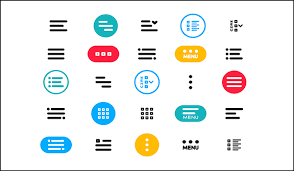 |
AuthorMantej Gill Archives
May 2023
Categories |
 RSS Feed
